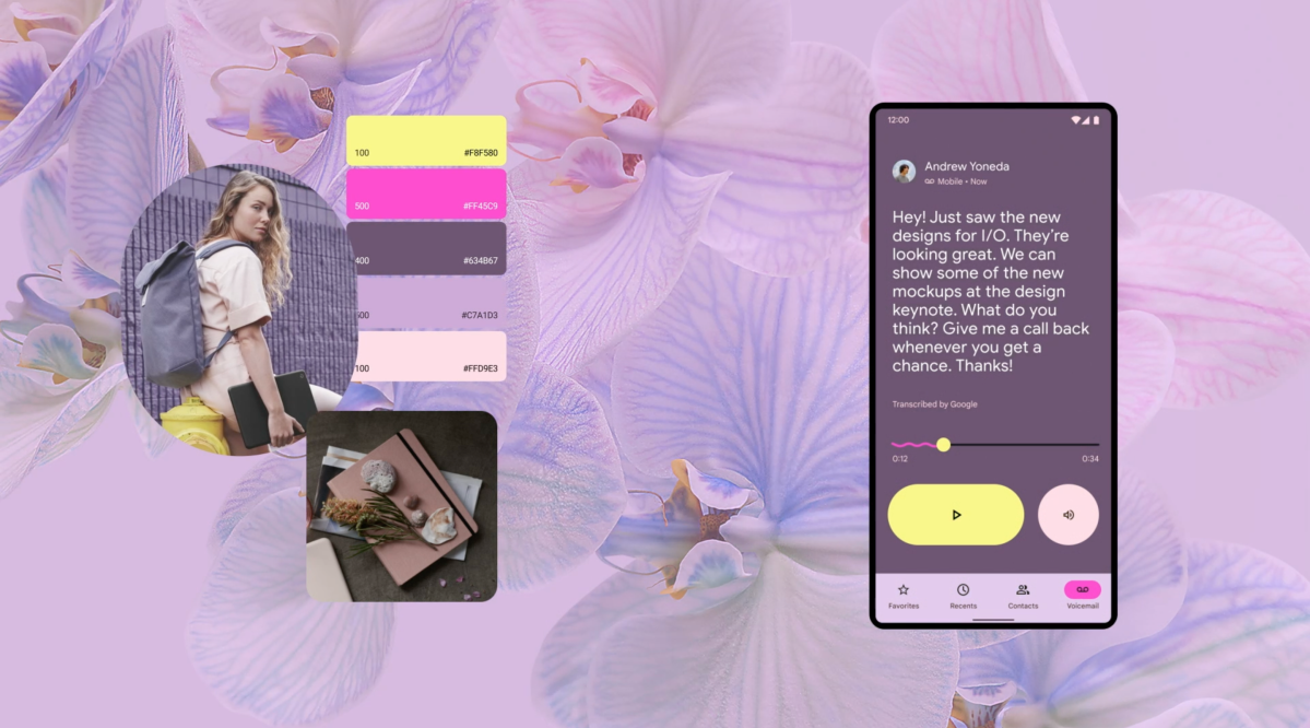
Material You is polarizing, with some believing it is the finest design change Google has ever given and others opposing the fun it offers. It’s the most recent version of Google’s Material Design framework, which was released alongside Android 5 Lollipop in 2014 in an effort to unify app design across its services and multiple form factors. While Material Design has always been more of a guideline than a set of hard and fast rules, especially after the 2018 Material Theming redesign. The new design experience is an even more radical departure from the strict design paradigms of the past. As technology becomes more prevalent and powerful, Google wants design to reflect emotion and people’s desire for “greater expressiveness and control over their own gadgets” via this new interface. As a result, the user is a co-creator of something as personal as wallpaper, which is utilised to build distinct Material palettes for the system, first-party, and third-party apps.
“We combine colour science with years of investment in the fields of interface design and engineering to enable real-time customization of any app, not only Google’s, to the user’s unique Material palette”, says Google. The new design interface is undoubtedly a risky experiment, but it appears to be a successful one. The new aesthetic approach has gotten more people talking about Google’s latest phones — the fantastic Pixel 6 and Pixel 6 Pro — and design in general, with many claiming that it makes iOS appear old. It’s also plausible that Google is in the midst of igniting a whole new wave of app design paradigms across many rival platforms, similar to how it did with the 2014 Material Design debut.

